




Mobile website management is the practice of editing, updating, and maintaining a website using a smartphone or tablet rather than a desktop computer. More than 60% of global web traffic now originates from mobile devices, which means your site’s mobile experience directly affects both your search rankings and your revenue. Google’s primary crawler, Googlebot-Smartphone, evaluates the mobile version of your site for search rankings, not the desktop version. That single fact makes the ability to manage website on mobile not just convenient but commercially necessary. This guide walks you through the tools, workflows, and optimisation tactics that actually work.
What tools do you need to manage website on mobile?
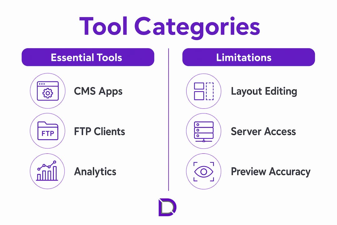
The right tools determine how much you can realistically accomplish from a phone or tablet. Mobile site administration falls across three broad categories: content management system (CMS) apps, file managers, and analytics dashboards.
CMS apps are the most common starting point. Platforms like WordPress offer dedicated mobile apps that let you publish posts, update pages, moderate comments, and manage media libraries. These apps handle the majority of day-to-day content tasks without requiring a desktop.

File managers and FTP apps give you direct access to your server files. Apps like FTP Disk or Solid Explorer let you upload files, edit configuration documents, and manage directories from your phone. They are best used for minor file corrections, not full site rebuilds.
Analytics dashboards round out the toolkit. Google Analytics and Google Search Console both have mobile-friendly interfaces that let you monitor traffic, spot errors, and track conversions on the go.
Mobile apps are well suited for content updates and basic edits, but building layouts or custom structures from scratch is faster and more precise on a desktop. Setting that expectation early saves you frustration.
| Tool category | Best for | Limitations |
|---|---|---|
| CMS mobile apps | Content edits, publishing, media | Limited layout control |
| FTP and file managers | File uploads, minor config edits | No visual preview |
| Analytics apps | Traffic monitoring, error alerts | Read-only, no site edits |
| Cloud storage apps | Asset management, backups | No direct site publishing |
Pro Tip: Prioritise tools that show a live mobile preview of your changes before you publish. Editing blind on a small screen is the fastest way to break your layout for real visitors.
How do you manage and update your website on mobile step by step?
A clear workflow prevents errors and keeps your site stable. Follow these steps every time you make changes from a mobile device.
-
Back up your site first. Before any edit, run a full website backup. Most hosting control panels offer one-click backups. This step takes two minutes and saves hours of recovery work if something goes wrong.
-
Confirm your access credentials. Log in to your CMS, hosting panel, or domain manager before you start. Losing your session mid-edit on a mobile network is common, so having credentials saved securely in a password manager prevents lockouts.
-
Make targeted content edits. Open your CMS app and navigate to the specific page or post you need to update. Edit text, swap images, or update links. Keep each editing session focused on one task to reduce the chance of accidental changes elsewhere.
-
Preview on your actual device. Most CMS platforms include a preview function. Use it. Then open the live URL in your phone’s browser to check how the change looks to a real visitor.
-
Test on a real mobile network. Testing over real mobile carrier networks gives you accurate performance data. Wi-Fi and desktop emulators mask the latency and speed constraints your visitors actually experience.
-
Check your analytics after publishing. Open Google Analytics or Search Console and confirm the updated page is loading correctly. Look for any spike in bounce rate or drop in session time, which can signal a broken element.
-
Prioritise your highest-traffic pages. Focus optimisation on top-traffic pages using a consistent test-fix-validate loop. This approach delivers the biggest return for the time you invest.
Pro Tip: Keep a simple notes app open alongside your CMS during mobile edits. Log every change you make, including the page name, what you changed, and the time. This log is invaluable when you need to roll back or troubleshoot later.
How do you optimise your website for mobile users?
Mobile optimisation goes well beyond making a site look good on a small screen. Speed, touch usability, and content hierarchy all affect whether visitors stay or leave.
Touch targets and navigation
Touch targets should be at least 44–48 pixels in height to reduce user errors and improve navigation usability. Buttons and links that are too small cause mis-taps, which frustrate visitors and increase bounce rates. Check every call-to-action button, menu item, and form field against this standard.
Page weight and loading speed
Typical WordPress pages carry between 2MB and 6MB of data, mainly from images and unoptimised scripts. Cutting that weight by half produces a measurable improvement in Core Web Vitals scores and real-world load times. Compress images before uploading, remove unused plugins, and defer non-critical JavaScript.
Mobile-first content structure
Mobile visitors scan rather than read. Lead with your most important content, keep paragraphs short, and use clear headings to break up text. A professional website structure designed for mobile-first consumption converts better than one retrofitted from desktop layouts.
Key mobile optimisation tactics to apply right now:
- Compress all images to under 150KB where possible
- Use system fonts or load no more than two web fonts per page
- Enable browser caching through your hosting settings
- Remove any plugin or script that is not actively contributing to conversions
- Set tap targets for all buttons and links to a minimum of 44 pixels
- Test your Core Web Vitals score monthly using Google Search Console
Optimising with real mobile user data rather than desktop assumptions is the difference between a site that ranks and one that stalls. Relying on desktop tools alone gives you an incomplete picture of how your visitors actually experience your pages.
What are the common challenges when managing a website on mobile?
Most problems with mobile site administration are predictable. Knowing them in advance means you can work around them rather than react to them.
Mobile optimisation issues are usually friction points like slow-loading hero images, awkward forms, or hard-to-use navigation. They rarely require a full redesign. That is good news because it means targeted fixes deliver real results without major investment.
The table below covers the most common challenges and practical fixes.
| Challenge | Why it happens | Fix |
|---|---|---|
| Limited screen space for layout edits | Small screens hide full-page context | Use desktop for layout work; mobile for content only |
| Slow network affecting uploads | Mobile data speeds vary significantly | Edit during off-peak hours or use Wi-Fi for large uploads |
| Desktop features not visible in mobile preview | CMS apps show simplified views | Always check the live URL in your phone browser after editing |
| Accidental edits or mis-taps | Small touch targets and dense interfaces | Zoom in before editing; use undo immediately after errors |
| Session timeouts mid-edit | Mobile browsers clear sessions faster | Save drafts frequently; use a password manager for quick re-login |
Syncing edits between desktop and mobile sessions is another common pain point. Cloud-based CMS platforms handle this automatically, but self-hosted setups sometimes create version conflicts if two sessions are open at once. Always close your desktop session before editing from mobile, or vice versa.
Key takeaways
Effective mobile website management combines the right tools, a disciplined workflow, and targeted optimisation based on real mobile user data rather than desktop assumptions.
| Point | Details |
|---|---|
| Mobile traffic dominates | Over 60% of global web traffic is mobile, making mobile management a business priority. |
| Use tools for their strengths | CMS apps suit content edits; use desktop for layout builds and structural changes. |
| Back up before every edit | A full site backup before mobile changes prevents costly recovery work. |
| Optimise touch and speed | Buttons need at least 44–48 pixels; page weight should be cut to improve load times. |
| Test on real networks | Emulators miss real-world latency; always test on an actual mobile carrier connection. |
What I’ve learned from managing sites on a phone
By James
The conventional wisdom says mobile management is a stopgap. You do it when you are away from your desk and need to fix something urgently. I used to believe that too. Then I noticed that some of my best-performing content updates happened on my phone, not because the tools were better, but because the constraint forced me to be specific.
When you cannot see the full page, you stop fussing over pixel-perfect layouts and focus on the one thing that actually matters: does this content serve the visitor? That discipline is worth something. The sites I manage that get the most consistent updates are the ones where the owner is comfortable making small changes from their phone on a Tuesday afternoon.
The mistake I see most often is business owners waiting until they are back at their desk to fix something they spotted on their phone. A broken link, an outdated price, a form that stopped working. That delay costs real visitors. The mobile site management workflow does not need to be perfect. It needs to be fast enough that you act on what you see.
My honest recommendation: set up your CMS app, connect your analytics dashboard, and practise making one small edit per week from your phone. Within a month, mobile management feels natural rather than stressful.
— James
How Com supports your mobile website management
Running a website from your phone is only as reliable as the hosting and domain infrastructure behind it. Com provides Australian-based domain management services and web hosting solutions built for business owners who need consistent performance whether they are at their desk or on the go.
Com’s local support team understands the specific needs of Australian businesses, from fast server response times that keep your mobile pages loading quickly, to domain controls you can access and update from any device. If you want a foundation that makes mobile site administration straightforward rather than stressful, Com is worth a conversation.
FAQ
What does it mean to manage a website on mobile?
Mobile website management means editing content, monitoring performance, and maintaining your site using a smartphone or tablet. It covers tasks from publishing blog posts to checking analytics and fixing broken links.
Can I build a full website from my phone?
Mobile apps handle content edits well but are not suited for full layout construction or custom design work. Use a desktop for structural builds and your phone for ongoing content updates and maintenance.
How do I test my website’s mobile performance accurately?
Test your site over a real mobile carrier network rather than Wi-Fi or a desktop emulator. Real network conditions reveal load time issues that emulators consistently miss.
What is the minimum touch target size for mobile websites?
Touch targets should be at least 44–48 pixels in height. Smaller targets cause mis-taps and increase bounce rates on mobile devices.
Why does Google care about my mobile site specifically?
Google’s primary crawler is Googlebot-Smartphone, which indexes and ranks your site based on its mobile version. A poor mobile experience directly lowers your search rankings, regardless of how good your desktop site looks.
Leave a Reply